Wondering how to get a post to go viral? There is no specific formula that guarantees that a post will go viral, but there are plenty of things you can do to make this more likely. Incorporate a number of techniques that work and make sure that these go into all posts. Once posts start to go viral, the success of the site or blog is sure to climb.
Perfect the Post
Posts that go viral have good mechanics because readers do not see posts with multiple errors as credible. When a reader does not lend credibility to a blog, they are far less likely to share it. Make sure to proofread your posts two to three times, as well as have someone else read them over, to eliminate the errors.
Optimize the Keywords
For your blog posts to go viral, you need to make sure people can find them easily online. This is where keywords come in. Perform some keyword research and use a mixture of popular terms that relate to the topic. The keywords should go into the title, first sentence and last paragraph. You should also work in related keywords throughout the post. However, it is critical to avoid stuffing keywords since search engines often view this as a negative.
Get Social with the Post
 Social media is where everything has a potential to go viral. When sharing a post, make sure that it is one that people can interact with. Start your blog with a question that relates to the post. This always triggers curiosity in people and they will want to read the post to answer the question. Another way to do this is to get in the comments section and make sure to interact with those leaving comments.
Share the Load
Talk to other bloggers and offer to link to their posts if they will link to yours. Of course, both parties will only do this on occasion and when the post they are linking to relates to what they are writing. This puts the post in front of more people and allows you to connect with fellow bloggers.
Optimize Any Image
 A good blog post always has a few images and you can use keywords to optimize this image just as you would the post itself. Use the most popular keyword and place it in the photo description when describing the purpose of the photo for the post.
Link Back to Website
When writing any blog post, be sure to include AT LEAST two links back to your website. It’s best to choose keywords within your post that people would perform a search for to get maximum exposure.
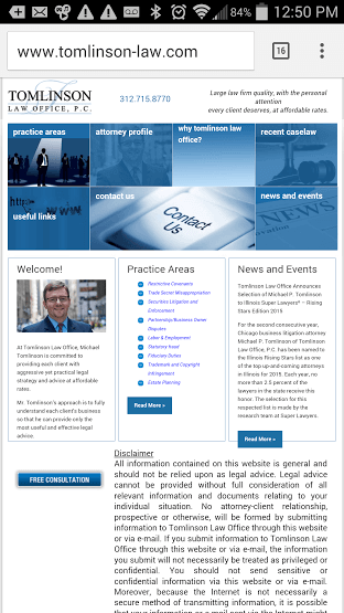
When someone visits your website, it takes them just eight seconds before they decide to leave or stay. Since they normally land on your homepage first, this page must impress your visitors. We’ve listed five sections required on your homepage to interest your visitors and make them stick around for more.
1) Contact Information
 Your visitors need to be able to contact you, especially if your website is selling something. You want to give them a variety of options, such as email, a physical address for postal mail and a phone number that someone answers during normal business hours. You can choose a prominent “Contact Us” link on your homepage or display the actual information in a place that is easy to see.
2) Easy Navigation
If your website is not easy to navigate, visitors will quickly leave. The important information on your site should have clear links so that visitors can find the right page without any effort. Things like your “About Us” page, an “FAQ” page, a page for “Shopping” or “Services,” a “Contact Us” page and a page for information on “Shipping” (if applicable) should be right on your homepage. You may need other clear links, depending on the purpose of your website.
3) Social Media Links
Every website needs associated social media pages today to better interact with customers. You should have links to your website’s associated social media pages prominently displayed on your homepage so that people can quickly find them. Many people place these near where they put their contact information since all of this information allows people to contact you and learn more.

4) Free Demo
Nothing will entice a customer more to continue exploring your products and services than by offering to give a free demo, because every body likes free, right? Having a potential client enter a few bits of information into a field that will funnel into a CRM system is gold, and they receive a snapshot if you will of the various products you offer with no strings attached.
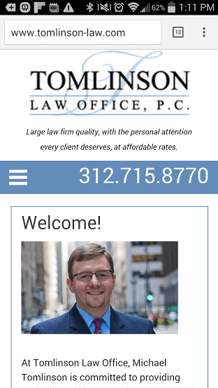
5) A Great Image
People are very visual, so if your homepage only contains blocks of text, this may be too boring and it is not a good incentive to stay. Place one or several images on your homepage that represents your website topic or your business. The image(s) should be clear and crisp, as well as colorful to catch someone’s attention.
 For months, webmasters around the world have been dreading the day when Google would officially launch a new algorithm that would penalize non-mobile friendly websites. Well folks, that day is nearing a bit closer.
On April 21st, Google will officially expand its use of using mobile-friendliness as a ranking signal. It will not matter if your website is based in the United States, Italy, or Russia – your website will be affected.
There are a few things to note before you panic. Here are three things worth noting:
• Googlebot must be allowed to crawl CSS and JavaScript before passing the mobile friendly test
• Scrambling to update your entire site is not necessary – mobile friendliness is determined at page level not site level
• Tablets will not be affected
What should I choose – Responsive Or a Mobile Website?
 Wondering what is the difference between a Responsive website and a Mobile Friendly website?
Let’s start with their similarities. Both will optimize your site for better readability on smaller screens, offer simpler navigation, and load much quicker. Your website will also show as mobile friendly in search results when your potential customers search for you (see Fig A below).

That however, is where similarities end. A mobile site is just a copy of your website and it resides on the server. When the server detects a mobile device it furnishes the mobile version instead of the desktop version. A responsive website is not a copy. It is your actual website that automatically adjusts the webpage to the screen size and orientation. This saves you the hassle of having to manage two different website versions. A separate mobile website could be a management nightmare especially if you have a lot of pages.
With a mobile site, you must set up a different URL (i.e. xyz.com/mobile or m.xyz.com) whereas a responsive design lets you keep everything the same and only needs some changes in your code.
Link equity will not count towards a mobile design but it will with a responsive design. This is because a responsive design embeds new code on the backend and again because the mobile site requires a new domain.
If a new phone emerges on the market, you may need to re-code the mobile design. A responsive design will automatically adjust to screen settings.
On April 21st, if your websites are not mobile friendly, this may severely affect your Google rankings. A lower ranking (or no ranking) can hurt your lead generation prospects and dramatically impact your lead pipeline. In some cases, the losses from ranking decrease can be in thousands of dollars and lead to being put out of business.
So, what next?
Ideally you would want your website to be a responsive website rather than having a separate mobile version of your site. But if you have a mobile version, you should be safe but it is advisable to get it converted to a responsive design due to reasons mentioned above. If your website isn’t responsive, take action today by following the steps below:
1) Test and see if your website is mobile ready. Click the button below to see if your site is mobile friendly.
TEST TO SEE IF YOU ARE MOBILE READY
2) If your website failed the test or if it is not mobile friendly, contact your webmaster immediately and ask him/her to start converting your website into a responsive format.
If you need help converting your site, call us at 847-220-9541 or simply click the FREE WEBSITE ANALYSIS button below. We’ll be happy to give you a Free Analysis and recommend the right approach.
No Redesign Necessary! We can simply work with your existing site and convert that into a mobile friendly site without having to do a complete redesign.
TEST TO SEE IF YOU ARE MOBILE READY
Below are some websites that our web team converted into a mobile friendly design.


 The mobile web has grown faster than a speeding bullet with 90% of American adults owning cell phones and 75% of those cell phones being Smart Phones. This has led to a huge boom in mobile searching and changed the way business owners market themselves forever. Smart Phones enable users to search the web from wherever they happen to be and makes information easier than ever to access.
Businesses Can No Longer Ignore the Mobile Web
Many business owners think that if they have a website then Smart Phone users can use their phones to search for them just as easily as they can on the desktop, but that just isn’t so. For one, websites look and act differently on a mobile device. Large image files and tiny links and buttons do not translate well. If your website isn’t optimized for the mobile web it will load slowly (or not at all) and be difficult to navigate, sending your customers straight to the competition.
It is thought that as many as 60+% of Smart Phone users are searching for local information and use their mobile devices while shopping. These searches are by serious customers who often click on links or actually make phone calls with a touch of a button when on your mobile website. That is traffic and conversion you simply can’t afford to leave on the table any longer.
Making the Mobile Web Work For Your Business
We’ve already talked about making sure your website is mobile responsive so now let’s pay attention to your outbound e-mail marketing. A recent report showed that close to half of all e-mails are now being opened on mobile devices but surprisingly, a whopping 89% of marketers are not optimizing their e-mail messages for mobile use. Talk about missing a huge opportunity! It isn’t hard to optimize your e-mail for mobile devices, concentrate on smaller image sizes, less but more central images and larger call to action buttons that are easy to hit with a thumb or finger on a small screen.
Another way to stay smart on mobile marketing is to focus on the new long-tail keywords people use when searching on the mobile web. People tent to search in long phrases, almost complete sentences sometimes due to the talk to text function of many devices. Make sure your keywords and content are conversation-friendly to attract more consumers.
In the last few weeks we’ve read numerous articles from people around the country via Facebook and Twitter voicing their opinion about where internet marketing is going so we thought our two cents can be thrown into the mix.
 For several years we at eBizUniverse have been helping small to medium sized businesses put their name on the map (i.e. Google, Yahoo!, Yelp, etc) so that people searching for their product can more easily locate the product(s) and place an order. Our most popular requested service is converting outdated HTML/CSS websites to a fully responsive WordPress platform making it easier and quicker than ever to launch a brand new website. We’ve found that in the last few years this demand has shifted more towards mobile optimization. Why is that? Because more and more people are using their mobile device to view websites, conduct research, and order products.
Another shifting trend is the advancement of social media platforms to do everything like contact friends without speaking, post what you ate for lunch or your plans that night, and the ability to upload product ads to market your business. Postal service marketing is all but dead due to high costs, and e-mail marketing is dying because of the ever present spam threat. So, why not utilize a platform that millions of Americans use multiple times per day and connect with people within seconds instead of hoping an e-mail or letter is opened?
Last but certainly not least, the evolution of social video. Ever hear of Instavid, Snapchat, or Hyperlapse? Don’t worry, if you haven’t, you will. You have heard what a blog is and who a blogger is, right?. But do you know what a vlog is? Or a micro-vlogger? Both of these trends are growing exponentially as these apps are attracting high school and college students each week. We know 160 characters is nowhere near leaving us, but for some a video selfie might catch someone’s attention quicker.
As we progress into the latter days of January, take a second to see what you could improve on regarding internet marketing. Chances are pretty high that our talented staff can help you succeed in the digital world. If you’re still unsure, give us a call today and speak with an eBizRepresentative – let us know what your goals are and how you’d want to achieve those goals in your mind.
Looking forward to hearing from you!
How to speed up my slow website
Many years ago, websites simply consisted of a few lines of text – loading almost instantly. However, as times have gone by, we’ve added more and more content to our websites, which results in websites which load slower.
Google uses page load speed as a ranking factor, so if appearing in search engines such as Google is important for your website, you should definitely consider the following points.
Optimize (compress) images
Since images usually take up a large percentage of your website’s content, it’s important for page speed that the sizes of these images are kept as small as possible, whilst maintaining high image quality.
Ideally, to get the best compression ratio, you should use a different compressor for each type of image; jpeg, png etc.
Related Topic: Why Website Speed Matters
For PNG images, I’d recommend using TinyPNG. On one image I tested – which was originally 2.85MB, TinyPNG reduced to just 685KB! That’s an incredible 77% reduction in size! Since this is lossy compression, you might notice a slight reduction in quality, but only when you inspect the images very closely.
If you have JPEG images (usually photos taken with a camera), JPEGmini is good choice here, and offers lossless compression. As an example, I managed to compress a JPEG image from 2870KB to 1927KB, with no visible loss of quality!
Enable Gzip Compression
This works by compressing your website’s content whilst in transit from your web host to the visitor. Most websites use gzip compression these days, so if you don’t implement it you’ll be left behind.
[button size=”big” text=”FREE Speed Analysis Of Your Website” link=”https://www.ebizuniverse.com/website-speed-optimization-analysis/” color=”blue”]
Enable Gzip Compression on Apache web servers
To enable it on Apache web servers, simply add the following code to your .htaccess file (which can be found in the main directory of your website):
AddOutputFilterByType DEFLATE text/plain
AddOutputFilterByType DEFLATE text/html
AddOutputFilterByType DEFLATE text/xml
AddOutputFilterByType DEFLATE text/css
AddOutputFilterByType DEFLATE application/xml
AddOutputFilterByType DEFLATE application/xhtml+xml
AddOutputFilterByType DEFLATE application/rss+xml
AddOutputFilterByType DEFLATE application/javascript
AddOutputFilterByType DEFLATE application/x-javascript
Read More: Get Expert Help with Website Speed Optimization
Enable Gzip Compression on NGINX web servers
Alternatively, if you use NGINX web server, you should add the following code to your configuration (config) file:
gzip on;
gzip_comp_level 2;
gzip_http_version 1.0;
gzip_proxied any;
gzip_min_length 1100;
gzip_buffers 16 8k;
gzip_types text/plain text/html text/css application/x-javascript text/xml application/xml application/xml+rss text/javascript;
# Disable for IE < 6 because there are some known problems
gzip_disable “MSIE [1-6].(?!.*SV1)”;
# Add a vary header for downstream proxies to avoid sending cached gzipped files to IE6
gzip_vary on;
For our site, this gave an incredible reduction in the size of our page, which relates to an increase in page speed of up to 78%!

Enable Browser Caching
If your website uses WordPress as it’s CMS, I’d recommend installing a plugin such as W3 Total Cache, which takes care of adding the code needed – all you need to do is activate the plugin and select the options.
Alternatively, if you’re not using WordPress, or you’d rather do this manually, simply add the following lines of code to your .htaccess file (located in the ‘public_html’ folder:
ExpiresActive On
ExpiresDefault “access plus 1 second”
ExpiresByType image/jpeg “access plus 2592000 seconds”
ExpiresByType image/jpg “access plus 2592000 seconds”
ExpiresByType image/png “access plus 2592000 seconds”
ExpiresByType image/gif “access plus 2592000 seconds”
ExpiresByType text/css “access plus 604800 seconds”
ExpiresByType text/javascript “access plus 604800 seconds”
ExpiresByType application/javascript “access plus 604800 seconds”
ExpiresByType text/html “access plus 2592000 seconds”
Use a CDN (Content Delivery Network)
Whilst you may have the perfect setup if you have a web server in the UK and 100% of your site’s visitors are based in the UK, the reality is usually that visitors come from all over the world. To have a web server in each of these countries would be an expensive nightmare, so CDN’s are becoming increasingly popular as a way to have a ‘virtual’ server in many countries across the world.
CDN companies essentially have servers in many locations across the world which hold (cache) copies of your website and it’s content such as images, videos, attachments etc. Most websites will usually have their website hosted in the USA or Europe, so if you’re based in Australia for example, it’d be much quicker to download large files such as images from a CDN in Sydney rather than the main web server in the USA or Europe.
Struggling with a slow website? These tips should help or if you’d like we’ll be happy to to take a look at your website and provide you a FREE review, Contact one of our consultants today or call us at 1-800-379-2829.
[button size=”big” text=”FREE Speed Analysis Of Your Website” link=”https://www.ebizuniverse.com/website-speed-optimization-analysis/” color=”blue”]
Website Speed Optimization Company
Web Design has gone through many transitions over the years and recent trends have many website owners opting for flat images, lots of white space and simplicity of design and there is a clear reason why. Your customers are highly visual and there are some basic psychological principles that influence how much they like your design and therefor how long they stay on your website.
Less Is More – The Power Of White Space
The buzz of the internet is so busy and aggressive that it can be overwhelming. Make your website a calm and professional place where white space is allowed to fill the gaps. Make your visual content simple yet powerful, your words inspiring yet concise and allow consumers to relax as they browse your website. Cut the clutter and get down to business!
Focus On What’s Important

Draw attention to headlines, key phrases and calls to action with creative headlines that are bigger and bolder than the rest of your text. Take snippets of important text and highlight them by adding color or changing font, just make sure not to go overboard, remembering that simplicity is still key.
Use Color To Influence Perception
Colors inspire emotions and for a majority of people there is a clear connection between specific colors and specific feelings. Make sure to keep the psychology of color in mind when choosing your brand colors and your web design colors. For instance, yellow is seen and friendly and fun where is red is attention grabbing, black is authoritative and green is calming. There are many color connections and combinations so do your research and combine the right colors with the right amount of white space for a killer website that people want to visit over and over again!
Get social with your web design
Keep your website fresh with live streaming content from your social media accounts and make sharing a snap with colorful easy to use social sharing buttons. These days your company’s social media accounts are just as important as your main website; so why not pack a double punch and integrate the two?

Individual sharing content via social media on a mobile device.
Customers thrive on status updates from companies
Many customers are relating to brands and businesses via social media these days. Checking our news feeds has become such a part of daily life it is there that customers are most easily connected to you. If you are diligently updating your social sites you can take advantage of these views by integrating your social media and website. You will create more continuity, a larger fan base and help boost your SEO.
Allow social sharing to be as commonplace as the update itself

Make sure your accounts are linked and you have adequately marketed your social media accounts on your website. Link to your accounts using the popular logos of your favorite social media platforms that people can easily identify. There are lots of free and paid logos of various styles you can use to create a more cohesive look with your brand.
In the mobile era, updates should be available everywhere

Rather than simply sliding in a link to your social media account you can go one step further by adding a live feed to your Facebook or Twitter account. Depending on the type of business you have than Instagram or Pinterest feeds might be relevant as well. This way there is a part of your website that is consistently refreshing and populating with new content. You can even allow users to “log in” to your website using their Facebook or Twitter accounts for a customized experience.
Content optimized to share will increase SEO

Make your content easy to share by including a great title, eye catching photos and a prominent set of social share buttons. You can easily add sharing options with apps, widgets or by asking your favorite web designer to include them for you. You’ve already worked hard to create share-worthy content so don’t take a step backwards by making it difficult or cumbersome for a user to spread your content like wildfire!
Web design is oftentimes thought to be a less complex thing than it actually is. There is a common misconception that website designers simply slap together a site that’s merely pretty, failing to see that intricate processes and functions that the site has behind the scenes that makes that website more usable to the everyday man and woman. Without taking into account how user friendly a site really is that the web design fails at creating a website that is beneficial to the business it represents and the visitors that come to the site in the first place.
What Makes a Web Design User Friendly?
Usability is about creating a website that is easy to read, view and navigate from the homepage to every other page on the site; beyond the task of making the site look appealing, there is the task of carefully formulating a place where visitors can come and traverse from page to page and blurb of information to blurb of information with ease. Sometimes making a website have easy usability depends on the you create it and in the article “10 Usability Tips for Web Designers” you can see first hand what make a web design the ultimate in user friendly.
When it comes to your website, the web design is vital to ensuring that your customers are not only satisfied with the visit, but that they are able to navigate it enough to actually make the sale for you. However, sometimes though a website design may look cohesive and in line with your company’s overall concept, it may be lacking a few key components that can boost the success of the site with your customers.
4 Ways to Boost Your Sales with a Better Web Design
In our search to help provide you readers with the right tools, information and services to help bring your website design into the modern era, we ran across a helpful article that might be just what you need to make your website better. The article, “These 4 Head-Smackingly Simple UX Changes Grew Sales 50%“, is a truly interesting in-depth look at four ways that you can help streamline your website and boost it’s sales. Remember, when it comes to web design knowing more about the successes and failures of your competition can help you succeed in the business world.
NAVIGATION
CONTACT US
CORPORATE OFFICE
SCHAUMBURG LOCATION
COMMUNITY